Updating old fonts
- Ana
- Mar 12, 2017
- 2 min read
One of my biggest difficulties in creating a new font (outside of the actual process of making it - I'm looking at you tricky kerning!) is knowing when something is good enough to be released. I know it can never be perfect (not yet!), but it is hard for me to know when to stop tweaking and finally put my work out there.
If it were up to my own judgement, I would never release any font. I can always think of things to improve: add more styles, add more weights, more ligatures, more accents, more alphabets! In short, it would be impossible for me to get as far in depth as I would like, while releasing more than a font a decade (and also keeping my day job). That is why I prefer to launch a font when I think it is good enough to sell and go back periodically and correct or add to it.
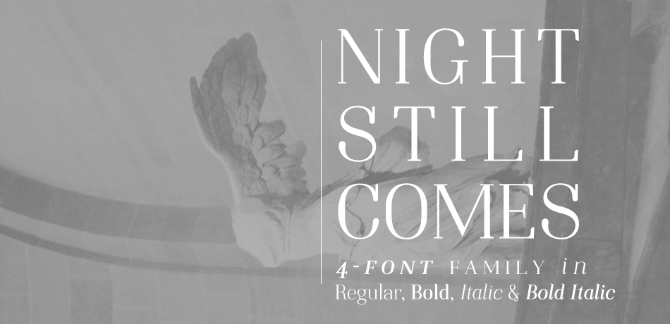
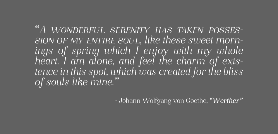
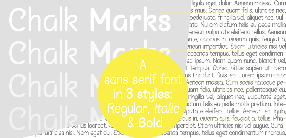
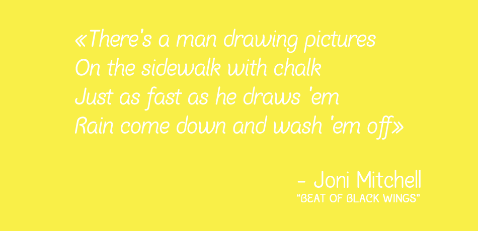
For instance, last summer I adjusted the kerning on Night Still Comes, and before starting to work on Strangeways I finally added italics to Chalk Marks. More recently, I decided to make a major update to Ana's Rusty Typewriter.
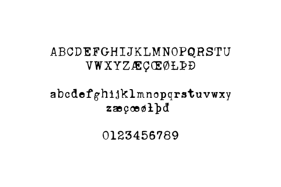
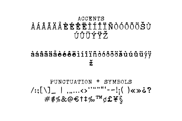
Rusty Typewriter was my first-ever font, when I was just learning how to work with the font-making software and still working out the proportions of each letter. The result was a quirky but flawed font (the proportions in some glyphs were off, there were too many missing characters, among other issues)... But people seemed to like it! Even though it has always been available for free, people have been paying the $5 commercial use fee. Some have even used it in their company logos! I, myself, have been using it regularly, and it is one of my favorites (can you say that about your own fonts without sounding like you're bragging? No? OK, just checking). So, this font was definitely overdue for an update. I have finally added accents, symbols, punctuation, and corrected proportions (while keeping some of the original "mistakes" that make the font stand-out). It is now a 200+ glyphs font, with a nearly complete basic character set.
Please check it out! If you would like to purchase it, you can do so here or here with some extra grungy textures. As always, if you use it, please share your work with me, I would love to see it!

